nopStation's Anywhere Slider plugin is developed to enable and manage customizable slider functionality on nopCommerce based online stores. This plugin enables quick and powerful image-based slider creation, display and management from the admin panel after a simple nopCommerce plugin download and installation. By utilizing this plugin, store owners can create beautiful and functional banners that enhance the design and functionality of their online store.
PRE-REQUISITES
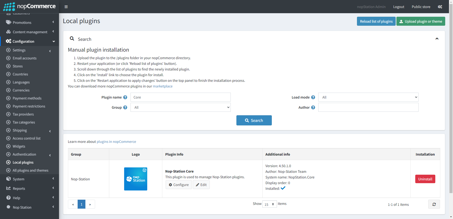
The plugin requires you to install the Nop-Station Core plugin first.
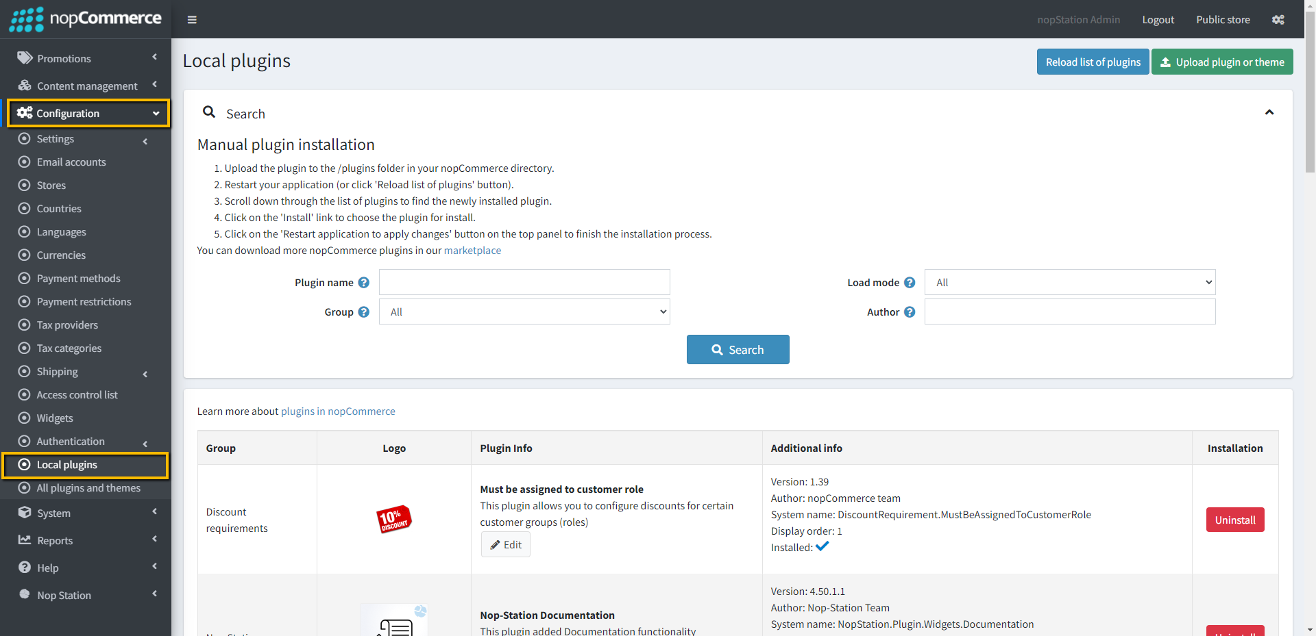
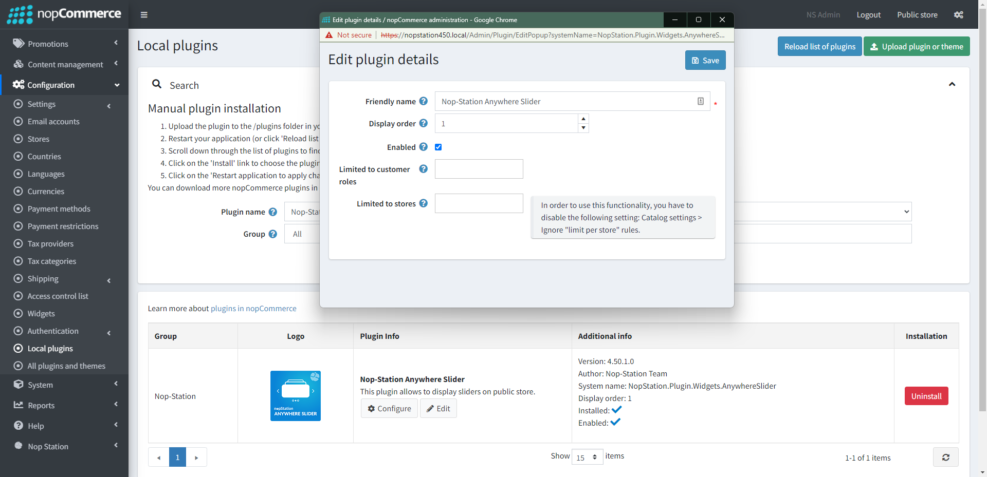
Go to Administration → Configuration → Local plugins
Upload the NopStation.AnywhereSlider zip file using the "Upload plugin or theme" button
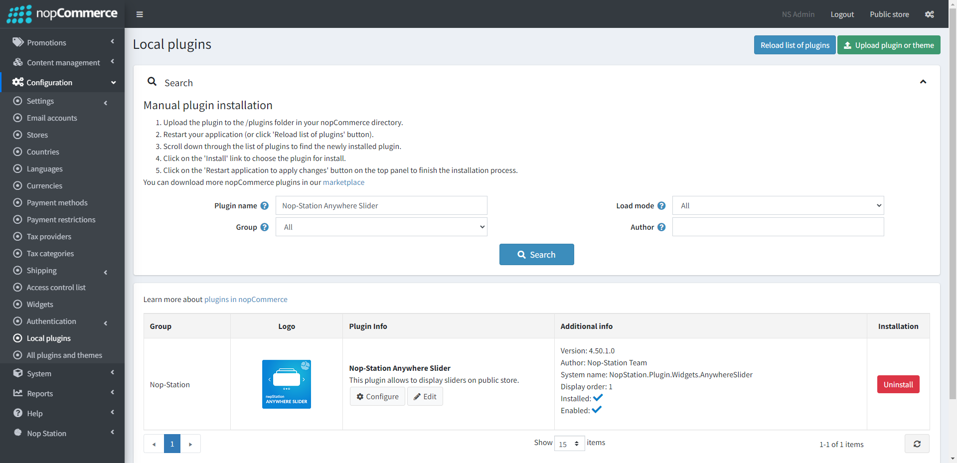
Go to Administration, reload the 'list of plugins'.Install 'Nop-Station Core' Plugin first and then install 'Nop-Station Anywhere Slider'
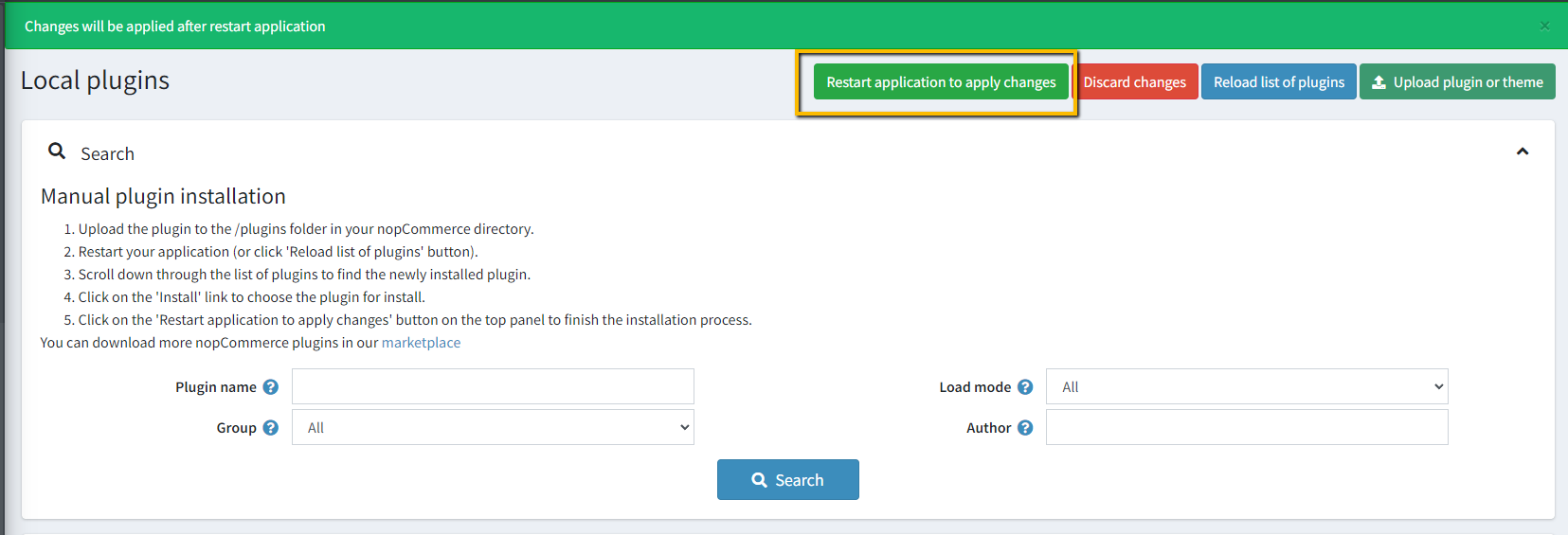
To make the plugins functional, restart the application
Enable the plugin with 'Edit' option and Configure it
CONFIGURATION
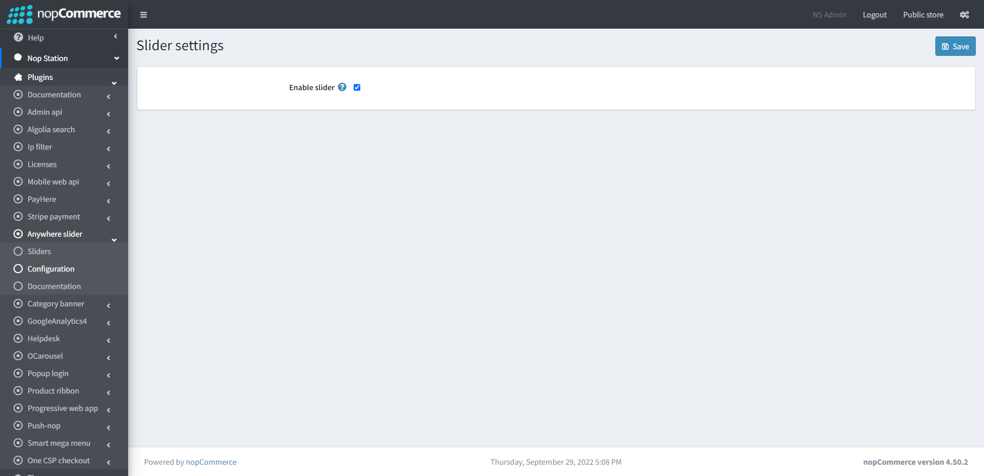
Go to Admin → Nop Station → Plugins → Anywhere slider → Configuration
Enable Slider: Check enable slider to enable the plugin
LIST
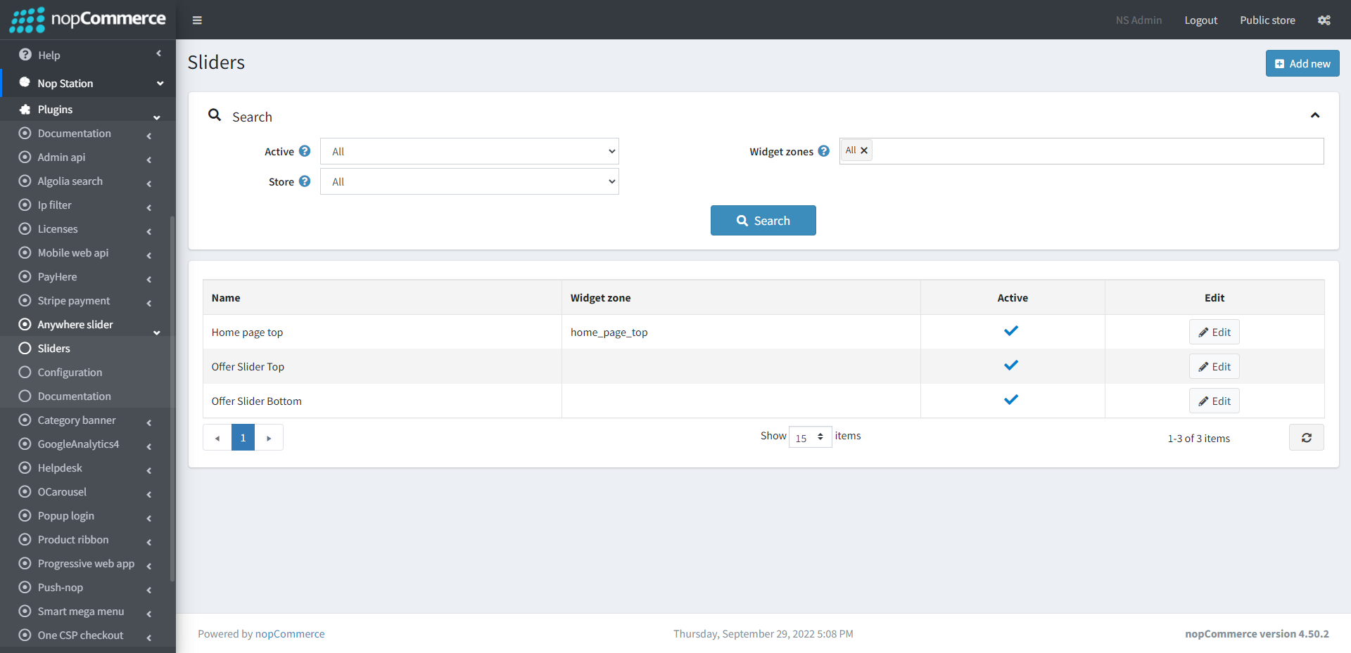
Go to Admin → Nop Station → Plugins → Anywhere slider → List
In this section you can show your list of active and inactive slider
On the top you can search slider by three fields Active, Widget zones and Store
CREATE/EDIT SLIDER
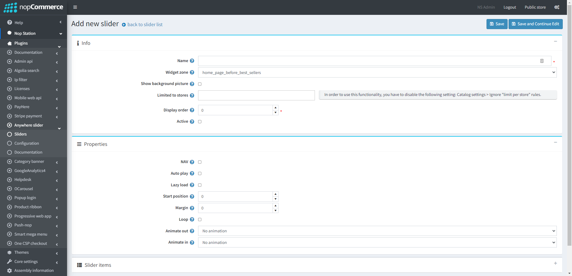
Create: To create a new slider, go to Slider list page Admin → Nop Station → Plugins → Anywhere slider → List and then click Add new button
To edit an existing slider, click on Edit button from slider list table
INFO
Name: The slider name
Widget zone: From the list of Widget Zones you can select the locations in which you want your slider to appear in your public store. If you want to add the slider to widget zones click the drop-down select your desired widget zone
Background picture: If you want to play slider without a homepage_top area, you can put a background image
Limited to stores: Option to limit this slider to a certain store, if you have multiple stores choose one or several from the list if you don’t use this option just leave this field empty
Display order: Display order is the order list of the slider, like 1 value represents the top of the slider
Active: Determines whether this slider will be active
PROPERTIES
NAV: By checking this property, it will display next/previous button on slider. If you want to hide these buttons, uncheck it
Autoplay: By checking this property, it enables auto play
Background picture: If you want to play slider without a homepage_top area, you can put a background image
Auto play timeout: It defines the duration of slider autoplay interval timeout (in miliseconds)
Auto play hover pause: It defines whether the slider autoplay will be paused on slider hover
Lazy load: Check to image lazy load for slider items
Margin: Give the margin value in pixel. It will be reflected on slider design
Loop: Check this property, if you want to continue autoplay
Animate out: Select an animation option from the animation dropdown list for CSS3 animation out
Animate in: Select an animation option from the dropdown list for CSS3 animation in
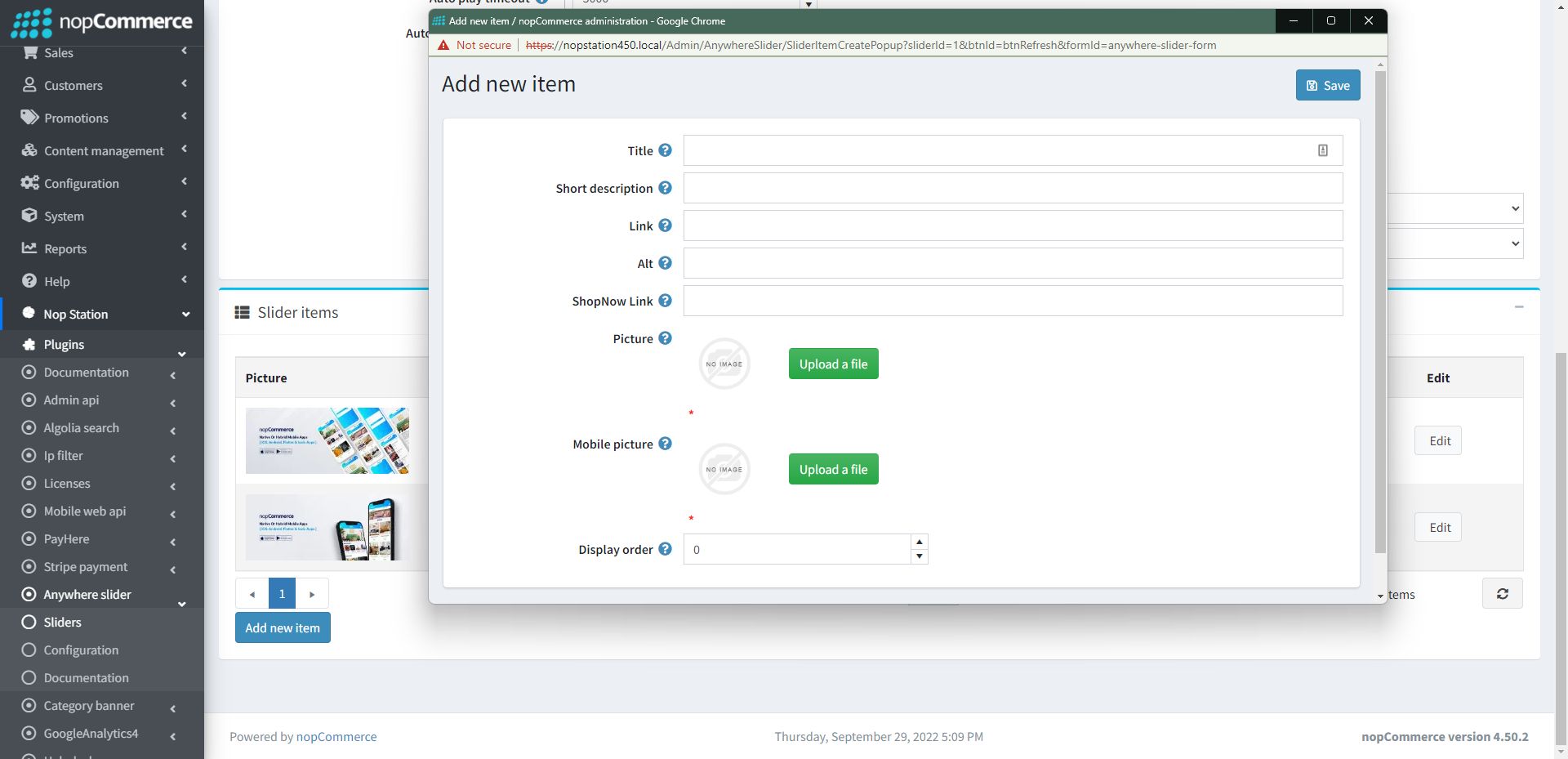
SLIDER ITEMS(EDIT VIEW)
Picture: From here you can choose a picture from your device and upload it
Mobile picture: The picture which will be displayed for mobile device
Alt: The image alt attribute (alternate text)
Title: Title of your image. This will be displayed on slider the slider image. Keep this field emplty if you don't want to display
Short Description: Short description about image. This will be displayed on slider the slider image. Keep this field empty if you don't want to display
Link: The URL for this image. By clicking on slider image, it will be redirected to this URL
Display order: The display order of the image. 1 represents the first slider image